Book Cover Redesign - Divergent
Typography
Objective
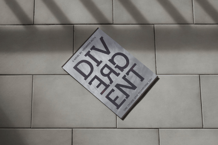
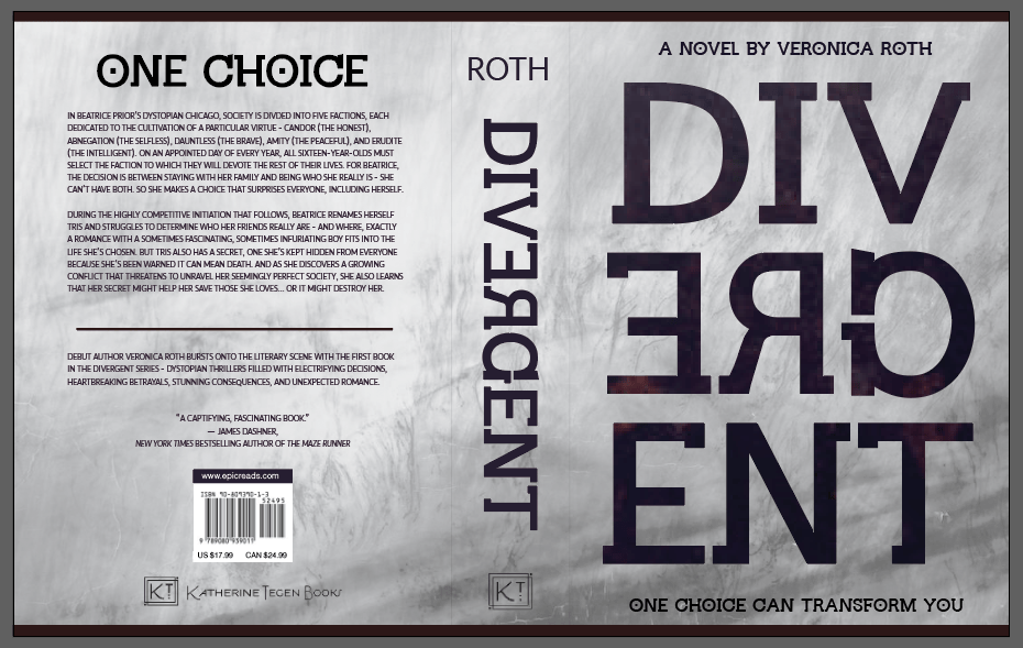
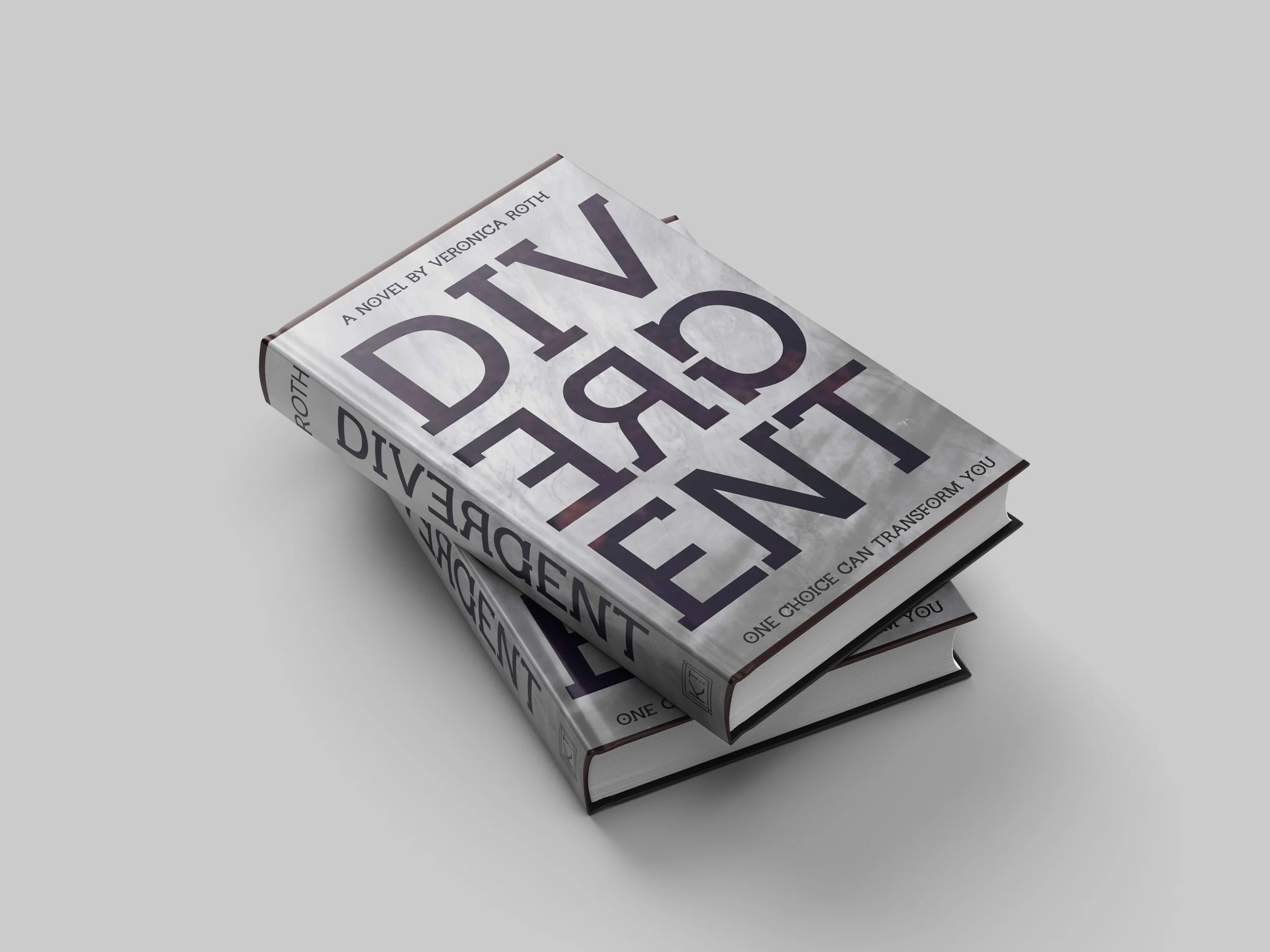
Divergent is a science fiction/dystopian/young adult novel. Chosen for a type book cover redesign, the goal was to come up with a design inspired by the meaning of divergent - tending to be different or develop in different directions. The parameters of this project were specific: use only typography in experimental and creative ways in order to attract attention, communicate a message, and represent the underlying theme of the book.
bEHIND THE dESIGN
Design choices included the hidden “divergent” component in the title (the “ERG”), representing the characters in the book that hide their identities; the deep red lettering, representing the “faction before blood” motto of the story; the use of the distressed texture, representing the dystopian society; and the “one choice” quote, representing the one chance the characters have to choose their forever identities.
Target Audience
Young adult readers, primarily ages 12-18
Older YA readers, such as those who grew up with the dystopian boom of Hunger Games, Maze Runner, etc.
Fans of dystopian worlds, faction systems, and moral dilemmas
Tools used
Adobe InDesign